Today, making a responsive website is a must. With 65.47% of internet traffic from mobile devices, websites must work well on any screen. This means a good experience on desktops, tablets, and phones. This leads to more people staying and interacting with your site.
We’ll look at top tools for making responsive websites. These tools simplify designing and help make eye-catching, useful sites. They offer drag-and-drop options and lots of customization. The web design tools for 2024 work well for both new and experienced users.
Using the right responsive website design tools can make your site look great on all devices. Now, let’s check out the leading tools. These will keep you ahead in designing websites.
Introduction to Responsive Web Design
Responsive web design (RWD) helps websites look great on all devices. Morten Hjerde and his team noticed a big change from 2005 to 2008. Over 400 devices with different screen sizes were sold. This shows why it’s key to make screens adapt for every user.
RWD uses flexible grids, fluid images, and smart CSS media queries. Ethan Marcotte called it “responsive design” in 2010. He focused on making sites work well on any screen. Media queries let us apply CSS based on device and user needs.
As devices change, web design faces new challenges. It’s important to use relative units in media queries and CSS tricks like max-width: 100% for images. Flexible grids help, too. We can use Flexbox, Grid, or Multi-column layouts to keep things looking right on all screens.
Mobile shopping is massive in the US, with 82% using smartphones to buy things. This fact shows we need web designs that work in both portrait and landscape modes. The idea of “responsive architecture” has made designers think about user-centered design. It adapts to user behavior and preferences.
Responsive web design isn’t just about how sites look. It’s also about making sites easy to use on any device. By using flexible designs, we make sure users have a good experience. This is true whether they’re on a laptop, tablet, or smartphone.
Why Responsive Design Tools Are Essential In Web Design
Today, mobile traffic is bigger than desktop use. This makes vital web design tools a must. Responsive design tools help make websites look great and work well on any device. A key fact is that over 61% of mobile users leave a site if it’s hard to use, showing the need for mobile-first designs.
Responsive design is key as the world uses smartphones more. Google said in 2015, being mobile-friendly is crucial for search rankings. This means sites must be easy to use on phones to engage users better.
Responsive tools are great not just for users, but they also cut costs. No need for separate mobile sites. With one responsive site, updating is easier. This makes things better for users, keeps them coming back, and saves money.
For SEO, responsive design boosts site rankings since Google likes mobile-friendly sites. Tools like Bootstrap and Foundation help make responsive sites. Google’s Mobile-Friendly Test and BrowserStack check if sites work well on different devices.
Big names like Smashing Magazine, BBC News, and Starbucks use these tools for better user experience. These tools make managing websites easier. They help make sure the site works well on all devices, easing marketing stress.
Using these important tools in your work means your site will not only draw in users but also keep them. Having a mobile-first design is key due to the growing mobile internet trend.
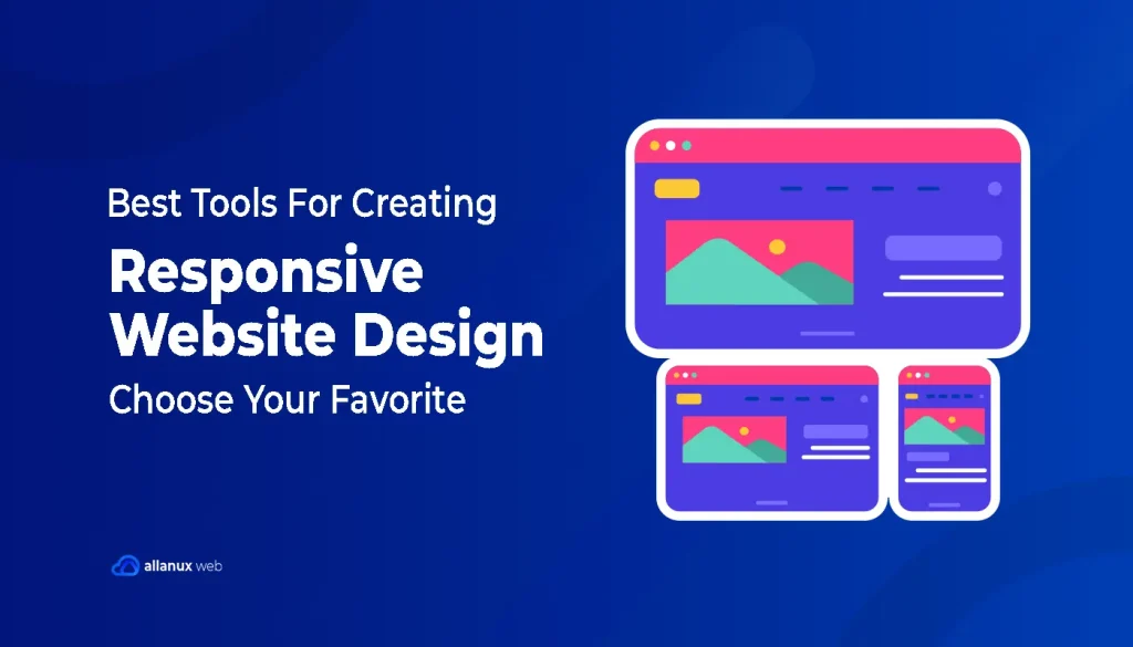
Best Tools For Creating Responsive Website Design
Finding the right responsive design tools is key for designers or developers. This list includes top solutions for usability, flexibility, and efficiency. These tools help make web design easy and professional, fitting all devices.
Since 2010, web pages have grown from 700kb to 2.2mb, mostly due to pictures and graphics. The need for good responsive web design tools has increased. Choosing the best software helps your site work well on all devices.
Elementor
Elementor is a top WordPress page builder. It changes the way you make responsive websites. With its easy drag-and-drop interface and live design, you can build complex layouts easily. No coding needed. This tool is great for designers, developers, and agencies. It helps make their work flow better and keeps the design quality high.
Key Features
Elementor has many features for modern web design:
- Device-specific previews for desktop, tablet, and mobile views
- Fluid grids use percentages, not pixels
- Uses Flexbox for dynamic sizing of elements
- CSS Grid for precise two-dimensional layouts
- Responsive breakpoints for styling and layout changes
Advantages of Using Elementor
Elementor stands out for many reasons:
- It works seamlessly with WordPress
- You see design changes in real time
- It has great mobile editing tools like font size and column width adjustments
- The drag-and-drop interface makes managing content easy
- Mobile-first features improve website performance and user experience
Responsive Design Capabilities
Elementor is excellent in responsive design. It has many tools and settings:
| Feature | Description |
|---|---|
| Mobile-First Approach | Automatically stacks columns vertically on mobile devices |
| Custom Breakpoints | You can adjust for specific screen sizes |
| Responsive Editing | Includes adjusting mobile font size, padding, and margin |
| Hide and Show Elements | You control element visibility by device |
| Reverse Columns | Changes content order for better mobile viewing |
Who Should Use This Tool?
Elementor is perfect for:
- Freelance designers who want fast and efficient designs
- Agencies that aim for high-quality websites quickly
- Web developers who want a versatile WordPress builder
- Digital marketers needing responsive websites and landing pages
Using Elementor can make a big difference in your web design projects today. It ensures your projects work well on all screens. And it offers a great user experience.
Webflow
Webflow is a versatile platform that combines design, animation, and content management. It lets people build sites without code. Over 380,000 professionals trust it, including workers from Pinterest, IDEO, and Salesforce. Users can design with visual CSS tools and not write any code.
Key Features
- Over 100 flexible templates, 21 of which are free, providing ample choices for designers.
- Advanced capabilities to add up to 5,000 lines of custom code per page for enhanced customizations.
- A robust CMS that manages various content types effectively, known as Webflow CMS.
- 99.9% uptime and fast loading times powered by Amazon Web Services and Fastly CDN.
- Visual CSS design tools for creating complex layouts without coding knowledge.
Advantages of Using Webflow
Webflow’s no-code approach is a big advantage. It lets designers be more creative. You can build and launch responsive sites fast. Webflow CMS is great for sites that need regular updates.
Responsive Design Capabilities
Responsive design is key in our mobile world. Webflow is great at this. It uses special units and fluid grids to fit content on all screens. Designs can start on mobile, then expand to larger screens. Webflow also makes sure images load quickly and look good everywhere.
Who Should Use This Tool?
Webflow is best for expert designers and industry pros. It’s for those who prefer creativity over coding. Also, companies needing flexible content management like Webflow CMS will benefit. Webflow has all you need to make modern, responsive sites.
Wix
Wix is a great choice for people who don’t know much about making websites. It has many templates and ways to customize your site. This makes it easy for small business owners and individuals to make beautiful, mobile-friendly websites.
Key Features
- Wix Studio Editor: This dynamic tool provides a variety of features for designing fully responsive sites efficiently, ensuring remarkable results.
- AI Tool: Utilizing artificial design intelligence, the one-click responsiveness feature automatically identifies and applies the best layout tools for different element groups.
- Inspector Panel: Comprehensive tool for altering an element’s responsive behavior across varying screen sizes, ensuring a seamless design process.
Advantages of Using Wix
- Fluid Grids: Enhances responsive design by allowing automatic adjustment to different screen spaces.
- Element Sizing: Offers flexibility by allowing users to edit sizes in pixels and select responsive behaviors.
- Custom Text Scaling: Users can define size ranges for text scaling, ensuring readability across all devices.
Responsive Design Capabilities
Wix truly supports making websites that look great on all devices. It adjusts sites to fit all screens well.
- Three Default Breakpoints: Desktop (1,001 pixels and up), tablet (751-1,000 pixels), and mobile (350-750 pixels).
- Cascade Design Concept: Allows changes made on larger breakpoints to trickle down to smaller ones without affecting the larger breakpoints.
- Text Scaling: Automatically adjusts text in proportion to screen size, with customizable minimum and maximum font sizes for optimal viewing on any device.
Who Should Use This Tool?
- Small business owners seeking hassle-free website creation.
- Personal website developers desiring effective and straightforward solutions.
- Users aiming to integrate design features efficiently without extensive coding knowledge.
In summary, Wix is a top-notch website builder. It uses artificial design intelligence to make website creation easy and visual. This is great for making responsive, nice-looking websites.
Squarespace
Squarespace is a top choice for creating beautiful, functional websites. It makes sure your site looks great on all devices. You don’t need to code anything special. The content on your site adjusts automatically for any screen size. This improves how users experience your site and keeps them engaged.
Key Features
Squarespace comes with useful features to make building websites easier:
- Beautiful Squarespace templates: Handcrafted and rigorously tested to provide stellar performance on any device.
- Integrated mobile design: Automatic adjustments to fit screens of all sizes, orientations, and resolutions.
- Extensive customization: Tools to tweak design elements and personalize content easily.
- Squarespace Analytics: Detailed insights to understand where your traffic is coming from and optimize your site.
- 24/7 email support: Constant customer support availability to address any issues promptly.
- Squarespace Circle: A community connecting professional designers for advice and networking.
Advantages of Using Squarespace
Squarespace offers many benefits, especially for people who love design and functionality:
- All-in-one platform: Combining design, hosting, and analytics tools in a single interface.
- Ease of use: Intuitive drag-and-drop interface suitable for users of all skill levels.
- SEO features: Built-in SEO tools help improve site visibility and traffic.
- Domain management: Capabilities to report abuse and maintain accurate Whois records for domain owners.
- Trademark protection: Prompt response to alleged trademark infringement.
Responsive Design Capabilities
Squarespace is great at responsive design, so you don’t need custom code for different devices. It can adjust your content well for phones or computers. This makes your site easier and cheaper to manage. And it’s important because a lot of web traffic now comes from mobile devices.
Who Should Use This Tool?
Squarespace is perfect for:
| User Type | Reason |
|---|---|
| Creatives & Artists | Its beautiful, responsive templates showcase portfolios effectively. |
| Small Business Owners | All-in-one platform simplifies management and optimization. |
| Budding Entrepreneurs | E-commerce tools and SEO features enhance business growth. |
| Professional Designers | Squarespace Circle offers a network for advice and opportunities. |
Adobe XD
Adobe XD is a top-notch design tool. It’s praised for its smooth interface and strong prototyping abilities. It lets designers make detailed, high-quality designs and prototypes. This tool works smoothly with other Adobe Creative Suite apps. This makes it a must-have for professional design teams.
Key Features
Adobe XD has features perfect for modern web and app design. Its vector design tools allow for precise, scalable artwork. The tool supports team design with real-time coediting. This means several team members can work together on a project at once. Plus, Adobe XD has awesome tools for making interactive prototypes and animations.
Advantages of Using Adobe XD
Adobe XD integrates well within the Adobe Creative Suite. This makes moving between apps like Photoshop and Illustrator easy. It boosts workflow efficiency a lot. The platform’s strength in making detailed prototypes and interactive elements is big. Designers can create real user experiences. Thanks to its focus on vector design, your creations stay sharp at any size.
Responsive Design Capabilities
Adobe XD shines in responsive design. It has great features like Fluid Grids, Flexible Layouts, and Adaptive Components. These tools let you make designs that adjust to all screen sizes and devices easily. With breakpoints, scalable components, and constraints, your layout stays consistent. No matter the device, your design works well.
Who Should Use This Tool?
Adobe XD is great for professional designers in Adobe Creative Suite teams. It’s also perfect for those making complex, interactive web and app prototypes. Designers aiming for detailed, universal user experiences benefit most. Students and beginners will find Adobe XD helpful too. Especially in courses like the Google UX Design Professional Certificate on Coursera.
Figma
Figma shines as a top choice for design teams, thanks to its powerful teamwork features. It lets many designers work together and see changes as they happen. This makes projects run smoother and faster. Figma is perfect for creating adaptable designs easily because of its smart tools.
Key Features
Figma has many features that make designing simpler. Important ones include:
- Vector networks and advanced vector editing
- Breakpoints plugin for responsive design
- Constraints and Auto Layout for designs that grow and shrink
- A big community with lots of plugins and resources
Advantages of Using Figma
Figma is great for team-based design work. It stands out by making responsive designs easy, without needing code. Also, its tools for making prototypes help show off designs in a realistic way.
Responsive Design Capabilities
Figma has many tools for making designs that work on all devices. The Fill containers and Constraints let you make designs that adjust smoothly. With Figma, tailoring designs for varied screen sizes gets much easier. This is key since a lot of design work involves adjusting for different devices.
Who Should Use This Tool?
Figma is perfect for web designers and teams working on UI/UX projects. It’s great for groups that need to stay in sync while working. If you need deep prototyping or work on user experiences, Figma’s tools are unmatched. It suits all kinds of design tasks, from complex to simple.
Bootstrap
Bootstrap leads the way in modern web development. It’s known for being easy to use and efficient. With the Bootstrap framework, building responsive sites is streamlined. It ensures adaptability on all devices and screen sizes.
Key Features
- Extensive Library: Bootstrap has a big collection of pre-styled responsive components. These speed up development.
- 12-Column Grid System: This system helps place elements based on screen size. It uses media queries for flexibility on various devices.
- Utility Classes: These classes make content management easy. They help show or hide components according to screen size. This optimizes user experience.
Advantages of Using Bootstrap
- Efficiency: Bootstrap’s large library and grid system cut down on development time.
- Consistency: It ensures a consistent experience on all devices. This improves usability.
- Customization: You can customize Bootstrap to fit design needs, even though it has ready-made resources.
Responsive Design Capabilities
The Bootstrap framework shines in responsive design capabilities. It uses a 12-column grid system. This helps make layouts that adapt well across all devices, from PCs to phones. The responsive utility classes, like “d-none” for hiding and “d-block” for showing elements, are key for a great user experience.
Testing tools are key for perfect responsiveness. Test for scalable viewports and content alignment. Also check image visibility, navigation, and scrollbars on various devices. With these tools, you ensure your responsive components work well and provide a smooth user experience.
Who Should Use This Tool?
Bootstrap is great for developers needing fast, reliable frameworks for the web. It suits those with tight deadlines or who value efficiency. Whether you’re experienced or new, the Bootstrap framework makes creating responsive designs easy.
Responsinator
Testing your website on different devices is easy with Responsinator. It’s a tool made for responsive testing. We’ll look at its key features, who it helps, and why it’s so good.
Key Features
- Responsinator shows your site in device mockups, making it clear how it responds.
- It lets you quickly check your site on phones and tablets.
- The interface is simple, so anyone can use it with ease.
Advantages of Using Responsinator
Responsinator is free, which is great for anyone on a tight budget. It uses real device mockups for realistic previews. This means you can test your site better.
Responsive Design Capabilities
Responsinator makes responsive testing fast. It shows your site on different screens. This helps make sure your site works well for everyone. The tool is simple to use, making testing smooth. It works with common devices and screen sizes.
Who Should Use This Tool?
Anyone who cares about user experience will love Responsinator. It’s perfect for making sure your site looks good on all devices. Both new and experienced web folks will find it helpful.
Sketch
Sketch is a great tool mainly for Mac users. It’s known for working with vectors well. It makes creating responsive interfaces easy. It works well with many plugins and apps, making your work smoother.
Key Features
- Vector-based interface design.
- Support for prototyping and collaborative workflows.
- Extensive plugin system and app integrations.
- Canvas offering infinite workspace for artboards and layers.
Advantages of Using Sketch
Using Sketch is great because it’s precise and easy to use. It’s good for new and experienced designers. The Auto Layout Plugin is a big help. It switches between portrait and landscape view quick. This is handy for making designs for all device sizes.
Responsive Design Capabilities
Sketch is amazing for responsive design. The Group Resizing and Smart Layout change with your content. So, making fluid layouts is easier. Plus, Anima integration means you can design complex stuff without coding. This makes designing for different screens simpler.
Who Should Use This Tool?
Interface designers and teams will find Sketch useful for its features. It’s awesome for making responsive designs. Its tools and integrations make it a must-have for pros who want detailed, accurate designs.
InVision
The InVision platform is a top choice for design technology. It helps teams work together better in a cloud setting. This makes it perfect for both teams and agencies.
Key Features
- Interactive mockups and prototypes
- Real-time collaboration and feedback
- Comprehensive suite of tools including Boards, Freehand, and Inspect
- Design System Manager for maintaining creative consistency
Advantages of Using InVision
InVision shines with powerful features for all team sizes. It boosts teamwork with quick feedback. This makes design tweaks fast and easy. The tech helps move from design to development easily too.
Responsive Design Capabilities
InVision excels in responsive design. It lets designers check how their work looks on any device. Tools like InVision Inspect make designs look good from phones to computers.
Who Should Use This Tool?
Design teams that love to work together should use InVision. It’s great for agencies and big teams needing fast feedback. InVision has all you need whether for interactive prototypes or responsive designs.
Marvel
Marvel is great for making design ideas into interactive prototypes. It’s known for easy prototyping and testing. This makes it key in designing responsive websites.
Key Features
Marvel lets you test prototypes on real devices. This gives a true feel of user interactions. It has a library for making responsive pages and works well with Sketch and Photoshop.
Advantages of Using Marvel
The interface of Marvel is user-friendly. It suits both new and experienced designers. It speeds up designing. You can quickly make changes and get fast feedback. This is key for validating designs early.
Responsive Design Capabilities
Marvel shines in creating responsive websites. You can check your designs on various devices easily. This means your pages will look good on phones and computers alike.
Who Should Use This Tool?
Marvel is for designers and developers who want to prototype and test efficiently. It’s great for teams needing fast feedback on their projects. Marvel is suited for both solo designers and big teams. It helps make and test responsive websites well.
FAQS
What are the best responsive web design tools available today?
Some of the best responsive web design tools include Adobe XD, Figma, Sketch, Bootstrap, and Google’s Material Design. These tools help in creating responsive web pages and enhance the web design process.
How can I create a responsive website using design software?
To create a responsive website, you can use design software like Figma or Adobe XD, which allow you to design flexible layouts. Additionally, employing CSS frameworks like Bootstrap can streamline the process of developing responsive web page layouts.
What role do testing tools play in responsive web design?
Testing tools are essential for ensuring that your website looks and functions well on various devices. Responsive testing tools, such as BrowserStack or Responsinator, allow you to see how your web applications perform across different screen sizes and resolutions.
Can you recommend any free tools for responsive web design?
Yes, there are several free tools for responsive web design, such as Google’s Responsive Design Checker, which helps you visualize how your web page will appear on multiple devices, and open-source frameworks like Bootstrap or Foundation.
What is the importance of design templates in responsive web design?
Design templates provide a foundation for building a responsive website. They ensure that your web design adheres to best practices, making it easier to create consistent and visually appealing layouts that adapt to various screen sizes.
How do I choose the right web design tools for my project?
When selecting web design tools for creating responsive web pages, consider factors such as the complexity of your project, your team’s skill level, and the specific features you need. It’s important to pick tools that enhance your design process while being user-friendly.
What is the approach to responsive web design?
A: The approach to responsive web design involves creating fluid grids, flexible images, and CSS media queries that adapt the web page layout to the viewing environment. This ensures that users have a seamless experience across different devices.
How can I use responsive design in my web development process?
You can use responsive design by implementing flexible grid layouts, utilizing media queries, and optimizing images to ensure that your web applications are accessible and user-friendly on all devices.
What are the benefits of using web design software for responsive web design?
Web design software streamlines the design and development process by offering pre-built components, templates, and collaboration features. This makes it easier to create responsive websites that are visually appealing and functional.
How do responsive testing tools improve my web development?
Responsive testing tools improve your web development by allowing you to see how your web applications behave on different devices. This ensures that any issues are identified and resolved before launching, leading to a better user experience.
